Jewelry, Form, and Fun

Before we go on and talk about form as an element of design, let’s talk about the pleasant, joyful aspects of jewelry form. What makes it fun?

There’s no doubt that jewelry is beautiful to behold, but jewelry is essentially small sculpture. So while it’s meant to be seen from multiple sides, jewelry—its form, surfaces, corners, edges, and texture, whether smooth, rough, nubby, scratchy—is really all about touch. In fact, most people who wear jewelry fiddle with it. Have you seen men and women finger a ring when nervous? Adjust a watch or bracelet? Slide a pendant on a chain? Pull an earring? Of course you have. You’ve done it yourself. (Pandora bracelets are excellent jewelry toys. They have substantial weight, they slide around the wrist, and the beads spin on their cables. You can even take all the beads off, reorganize them, and put them back on the cable. Perfect for fiddling!) Continue reading

Combining Geometric and Organic Shapes in Artisan Jewelry

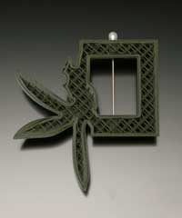
Rebecca Strzelec creates an interesting piece by combining organic and geometric shapes in Cross section #5, from her Army Green Orchids series. Photo courtesy Rebecca Strzelec.

Rebecca Strzelec creates an interesting piece by combining organic and geometric shapes in Cross section #5, from her Army Green Orchids series. Photo courtesy Rebecca Strzelec.

While shapes may loosely be grouped into geometric and organic categories, jewelry—or any object, really—rarely falls into one camp or the other. For example, in this piece from her Army Green Orchids series (2006), Rebecca Strzelec, Professor of Visual Arts, at Penn State University, Altoona College, combines a rigid rectangular shape (as well as a girder-like interior) with the gently curving outlines of flowers—orchids, to be exact.

Strzelec printed the piece in toy-soldier plastics using flower shapes to make a particular point (read her artist statements here). However, even knowing nothing of the artist’s intent, the piece can be appreciated on its own merits simply by looking at the combination of shapes.

Form: Where Line, Shape, and Space Converge

I probably should have put a warning notice upfront before I began this series of posts on the elements and principles of design. Although I’m going to discuss each of these separately, it’s really impossible to separate them. While I danced around this in my posts on shape, I can’t tap dance fast enough to get around it here, when we begin to look at form. Because this is where the language gets muddy. Stick with me and see. Continue reading

Shapes: On the Edge

Because shapes inhabit finite areas, they have edges. Edges are always active places, where the material, color, dimension/thickness, elevation or texture changes. At edges things can dissolve, penetrate, escape and enter each other—think about cells. They can dive under or soar above each other.

Edges slice, border, enclose, separate, divide, surround, protect. If interior shapes pierce other interior shapes or the borders of the piece, they may be interpreted as either having a lack of control or making a bid for freedom.
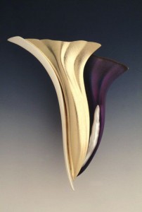
"Second Blossom." Betty Helen Longhi. 18k/ss bi-metal, sterling, niobium, stick pearl. Photo Michael Cunningham. Photo courtesy of the artist.

“Second Blossom.” Betty Helen Longhi. 18k/ss bi-metal, sterling, niobium, stick pearl. Photo Michael Cunningham. Photo courtesy of the artist.

Edges are where things can change from solid to insubstantial or back—and usually suddenly. (We use the term “on edge” when we’re tense or irritable. Or “edgy” when something is new, pushing the envelope, pushing the edge.) As a result, edges can be exciting or terrifying. Stand on the edge of Grand Canyon and depending on how you feel about heights or space, you’ll see what I mean.

As we’ve already seen, edges are not seen alone but in context with other shapes. If a transparent or translucent shape overlaps another shape, it can alter the color or the apparent texture of the shape below it. That area of overlapping creates yet another shape, one with its own edges. It’s like looking into a hall of mirrors.

The quality of its edge says something about a shape. Edges may be blurred, sharp, soft, rough—do you want to approach or back away? Torn, ragged edges say something different from smooth, worked edges—is it old, worn, experienced or new? Edges stop the eye or, if permeable or fuzzy, let the viewer’s eye roam past.

The way shapes interact at their edges can carry meaning. Look at Betty Helen Longhi’s brooch, “Second Blossom.” There is a small change at the edge between the sterling and the gold–some change of dimension, some in color. But there is a much more pronounced change between the gold and the purple anodized niobium. The darkness of the color exaggerates the edge and the apparent depth of the “drop off.” But from that difference in edge springs a pearl–symbolic of new growth. 

One of the most important shape edges in jewelry is the border of the piece, the place where the jewelry meets the air, clothing, or body. These edges are usually sharp and definite, framing the piece so that everything inside the edge becomes the subject when seen in the larger context of the body’s background. Edges determine where your piece ends, how large it will be.

So what’s your edge?


Storytelling with Shape in Jewelry Design

All the elements of design tend to have certain connotations to makers and viewers. Shape is no different. Rectilinear geometric shapes, for example, often create a feeling of something artificial, man-made, architectural, or structural. Some people may consider these shapes more masculine, intellectual, planned, thoughtful, or contrived. They may seem aloof, rigid, distant, stable, dependable. Such shapes may feel conservative—even the slang term “square” means out of step with the times. Continue reading

More on Figure/Ground in Jewelry Design

Being clear about which shapes or group of shapes is the subject or focus of a jewelry piece helps you direct the viewer’s attention to where you want it. If the visual weight of the figure (focal point) and the ground (background) are equal—in area, contrast, color, or texture–the eye can’t tell what the “subject” is.

You’ve probably seen the classic visual exercise used to help people see the relationship between the subject and background in a work. Continue reading

Positive and Negative Shapes in Jewelry Design

Shapes in design are never seen alone. They are always seen in relationship to the shapes or the area around them. This is because, at its simplest level, the mind sees everything as either/or. It puts whatever it sees into one of two general categories: this/that, friend/foe, dark/light, good/bad, edible/inedible, important/unimportant, and so on. Continue reading

Shape in Jewelry Design

Two terms describe the dimensionality of elements in jewelry: shape and form. Shape refers to the outline of a flat, two-dimensional area; form refers to the volume of space occupied by three-dimensional objects. Continue reading

Use Line to Create Meaning in Jewelry Design

Depending on the type of line you use in a jewelry design, its thickness, and direction, you can invest the piece with meaning. It can affect the impact your piece has on viewers and whether they continue to look at your work or walk away. Continue reading

Lines and Gesture in Jewelry Design

Do you draw conclusions about your friends, family members, doctors, or first grade teachers from their handwriting: neat, repressed, artistic, bold and so on? In the same way, the line gesture in your work tells its own story. Continue reading