Depending on the type of line you use in a jewelry design, its thickness, and direction, you can invest the piece with meaning. It can affect the impact your piece has on viewers and whether they continue to look at your work or walk away. Continue reading
Category Archives: Element of Line
Lines and Gesture in Jewelry Design
Do you draw conclusions about your friends, family members, doctors, or first grade teachers from their handwriting: neat, repressed, artistic, bold and so on? In the same way, the line gesture in your work tells its own story. Continue reading
Surface Lines in Jewelry Design
While lines in jewelry design are often used to create movement or to guide a viewer’s eye around a piece, lines can do more. Artists can use lines to enhance or emphasis a surface. Continue reading
Guiding Lines in Jewelry Design
One of the most common uses of line in design is to gently (or not so gently) tug the viewer’s eye in a guided tour of the work. They can do this because lines usually have direction. They lean forward or back. They curl around, widen and thin. Artists can use this directional tendency to tell the viewer: “See this? Now, see this? Now look over here.” Continue reading
What Makes “Line” in Jewelry Design?

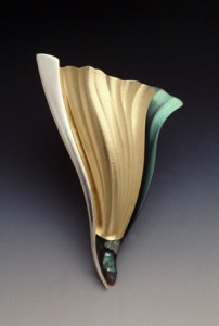
Ridge peaks and places where two dissimilar materials meet are seen as lines. Floating Free, by Betty Helen Longhi. Courtesy of the artist.
Line is the most individual of marks. It is the first mark we make as children. Lines are the result of movement—stick in the sand, pen on paper. Because we each move with a different type and level of intention, a different force–whether we’re talking with our hands or doing daily chores–each of us draws or writes with a different line quality. In fact, the lines we make are so intimately tied to our unique ways of moving, that each of us has a unique signature, used for centuries for identification. Although how long that will last in a digital age is anyone’s guess. Continue reading
Not So Simple Line
Line is the simplest element of design. It should not, however, be dismissed as boring. Line is filled with possibility. Just ask any kid with a crayon.
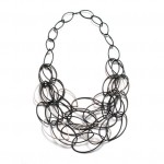
Proof of this is in Megan Auman’s “Maya Necklace,” made of sterling and blackened steel wire. Created from interlocking, tear-shaped links, the work is a great study in the use of line: line to create value, form, movement, and visual weight.
When working with a pencil, a thicker line equals darker value. Although Auman has used wire of all the same gauge, that is disguised by the way she layers the links. The value appears darker where she has used several links together—like lines in a doodle that are scribbled over will look darker. Single steel links look lighter in value, and where the silver and blackened steel links are jumbled, the value becomes distinctly gray. This is all punctuated by the simple silver links—the lightest value of all.
The loose connections between the links create actual movement, of course. However, by varying the way the links are joined, and by overlapping layers of wire, Auman creates a playful, scribble quality that gives the necklace high visual energy. Even if the links did not actually move, the necklace looks like it’s in motion. The randomness keeps the eye moving, too, always looking for the next area of interest.
One of the neatest tricks of “Maya Necklace” is how Auman uses a simple, lightweight material, combined with the open interior of the links, to create a feeling of volume and form. Our mind sees the outline of the total shape of the necklace, and says, “Hmmm. Big shape. Must equal big weight.” So our brain assigns the piece the piece more substance that it actually has. This is the kind of thing that is especially useful for jewelry artists who might want to work in an expensive material without a lot of expense. You can create a statement piece with a minimum of materials.
Value, form, movement, playfulness, substance—all with a simple line. Maybe not so simple after all.
“Line is at once the most illusory and the most fundamental of the design elements.”
Quote
Marjorie Elliott Bevlin, Design Through Discovery: The Elements and Principles, 2nd edition.

